Monday, October 5, 2015

"Strong Independent Black Woman"

For my Political Body assignment, I decided to focus on my racial identity and how it affects my perspective of the world as well as how others perceive me. Living in America, I have noticed a range of stereotypes relating to my race in the media, and I understand the history behind them. Although I grew up in Canada, raised by West African parents, these stereotypes still sometimes affect me due simply to the color of my skin.

One stereotype that has bothered me a lot is too often used in the media. Black women are often portrayed as sassy, as sidekicks, as unemotional or sometimes even angry. The term “strong independent black woman” is something I have heard since I was a child. Some of my friends would even use that term to describe me if something went wrong. I know they were joking, but it often bothered me, making me feel as though I wasn’t allowed to feel troubled or defeated every now and then.

In researching for this project, I looked at the art of a number of black female artists, several of which we discussed in class. Many of the artists, Renee Cox in particular, often portrayed the black female form in a place of strength. It didn’t feel like a stereotype, however. It was a sense of strength that I long to feel. But I was also interested to find works by black female artists that used the black female figure to exhibit a sense of vulnerability and longing. Samella Lewis did a number of portraits that show black women as I had never seen them before. Her works were some that I could personally relate to, as I often feel, especially at this point in my life, more vulnerable than strong and independent.

I was particularly inspired by an Adrian Piper piece, titled What It’s Like, What It Is #2. In this piece, there is a drawing of a black face over a job application, with the word “IT” written over it in large red letters. This piece really spoke to me. My mom struggled to find work as an African immigrant when she first came over to North America, and the first thing that would show her difference would be the color of her skin. It made me also think of my own life, and all the boxes I’ve had to fill. Even when I applied to Chapman – I checked off “black” and “female” – was I only let in to fill a quota? I like to believe that I am talented enough to deserve the opportunities that I receive, but what if I am seen as a statistic, and not as a person?

My piece explores both my feelings towards applications as a woman of color, as well as how I feel like many black women do not always fit the stereotype of “strong independent black woman”. With these stereotypes, many black women feel as though they are reduced to something less than human. I wanted to show the black female form in a way that exhibited vulnerability.

References:
I Found My Blackness


Samella Lewis, Self Portrait
Samella Lewis, Home Sweet Home
Renee Cox, Yo Mamma
Renee Cox, 41 Shots at Green River
Renee Cox, Yo Mamma Young
Kara Walker, Alabama Loyalists Greeting the Federal Gun-Boats
Andrea Bowers, People Before Profits 
Adrian Piper, Self Portrait Exaggerating My Negroid Features

Adrian Piper, What It's Like, What It Is #2
Carrie Mae Weems, Mirror, Mirror

Matters


In "Matters," I wanted to explore apathy as a political position and explore my feelings towards it. I believe that our generation—and especially the predominately white, straight, middle class that I have been raised with—is especially apathetic. The exact cause of this is circumstance is unclear—though, I have a few ideas as to what has fed this attitude of “DGAF”edness.

I watched Lana Del Rey music videos to prepare for this project—to try to feel the melancholic, detached media that so many young adults seem to identify with. It took some time to get beyond the singer’s unique, sad beauty, but I eventually figured out her carefully devised perspective. She, in her art at least, embodies the sad, rich 50’s housewife. Her videos are all sub-par in terms of image quality in order to indicate that they are vintage, and she often incorporates Hamptonsesque locations. She sings of love, drugs, and a simpler life. Yet, the viewer knows that she has everything that our society values: beauty, money, talent, fame, gorgeous lovers, etc. Despite having it all, she is still so incredibly unhappy. This, for some reason, really resonates with a large portion of my generation. I believe it is because we have been plagued with a profound feeling of nihilism in our day-to-day life.

Maybe it’s technology. Our generation is the first to have grown up with electronic identities—careful performative constructions of our selves. They bear as much weight as our physical bodies—our place in our social network can be pinpointed by the number of likes we receive, and our essence can be characterized by the pages we follow. Yet, we grew up being told that there was a huge difference between our offline and online actions: our online actions are permanent. Once they are posted, they can never be taken back. They can never be changed. So what does that mean for our physical selves? How impermanent is our state of being in real life? As many of my peers have said, “if you didn’t post it on Instagram, did it really happen?”

Maybe it’s just a post-modern predicament. We live in an age of ambiguous meaning. There is no one single “truth”: art cannot be pinned down, religion is based on the individual, scientific proof doesn’t even bear meaning in our government. (For example, how many times has the proof for climate change been dismissed by politicians because the findings cannot definitively be traced to humans?) We have seen--or at least, we have been told of--instantaneous mass destruction. The atomic bomb showed us that everything we are familiar with can be gone in an instant. 

So what does it all mean? Why does it make a difference what I do? Nothing is really tangible, after all. Nothing I do matters. 

Yet, of course, everything we do matters. It causes physical or mental change. It morphs our environment. Perhaps our effect on the world is minimal--but we are so closely tied to our surroundings, that what we do matters. From an ideological nihilistic perspective, it may not. But on a physical level, we are matter--therefore we affect matter.

I chose to create my piece with our environmental connectedness in mind. I chose to make the foreground of my drawing with one, continuous, looping line. Even the fragmented, apathetic individual who says that "Nothing [they] do matters" is connected to the rest of the world. 


Espen Kluge - 74: Meditation, 2014

Herbert Baglion- Untitled

Rob Gonzalves

Boris Schmitz - This Kiss 3

Unknown - Geometric Mountains

Unknown

Kim Michey

Keith Haring - Silence = Death, 1989

James Collins

James Nares

James Nares


https://www.youtube.com/watch?v=QnxpHIl5Ynw
http://eds.b.ebscohost.com.libproxy.chapman.edu/eds/pdfviewer/pdfviewer?sid=46102b8a-1f3d-49bf-80af-81dc96a7e56d%40sessionmgr111&vid=0&hid=122
http://aliciapatterson.org/stories/placing-risk-between-panic-and-apathy-new-industry-emerges
https://www.youtube.com/watch?v=L6K8Uq88BEQ
http://eds.b.ebscohost.com.libproxy.chapman.edu/eds/pdfviewer/pdfviewer?vid=11&sid=918a8330-1f89-462c-b924-7133126a3446%40sessionmgr115&hid=122

The Pro-Choice/Anti-Wellfare Paradox


Caitlin Albritton
Life Drawing
The Paradox of Pro-life / Anti-welfare

            I went through many ideas and themes before coming to this one. While the topic of abortion is fortunately not one I’ve had personal experience with, it is one I feel passionate about as I see it as a feminist issue. I am also concerned with issues regarding people living in poverty, and those who work full time and still aren’t making a livable, minimum wage. I chose to articulate both of these issues by bringing attention to those who are both pro-life and anti-welfare.
            Insisting that abortion is immoral, and should be illegal, appears harsh to me in its own right. But when it is paired with the desire to cut or limit government aid to support the child that comes from it, it seems heartless and cruel. I get the sense that some of the people who think like this feel the woman is in the wrong for doing the actions that led to the unwanted pregnancy, and see the results as a natural punishment. They don’t want to pay the price for another woman’s mistake. There is this judgmental separation between the woman who needs an abortion and the other who won’t support her in having it. That the woman who is pregnant is careless, or indulgent, that the other woman is far above making mistakes like this. A person who thinks this way must think that the pregnant woman’s situation is unlike one that she’ll ever be stuck in. That haughty, better-than-you thinking is what really frustrates me. The unwillingness to accept that we are all people, we all make mistakes and sometimes we all need help, is a very small and limited way of thinking.
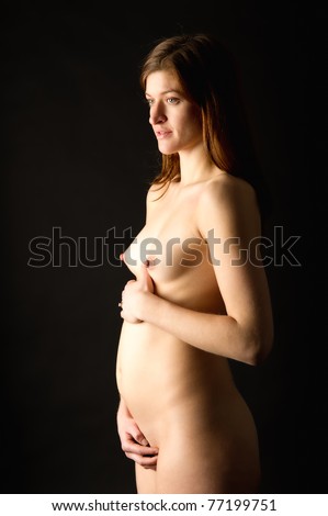
            I chose to represent this paradox by tattooing the words, “ you care enough about my child to see that it has life, but not enough to see that it’s a good one,” across the swollen bellies and bodies of three faceless women. It was important to me that they were faceless so that the bodies would represent women as a whole, and so as not to individualize any of them. I also chose to end the bodies ambiguously above the knee, so that the bodies seemed less grounded. This gives the effect of being less human and more metaphorical, symbolic. I’ve seen many political cartoons calling attention to the fact that certain people seem so invested in these women’s lives, and their baby’s life, until it is born. Once the mother and child are struggling together in the world, they are met with judgment and derision for being in their position rather than aid and support that they may desperately need. How can a person care so much that a pregnancy is carried to term, only to see that the family now suffers, and be unwilling to help? If people really cared about the life of the child, they should care for more than the first 9 months of it, and provide support for the family if in need.
            This piece is much more politically aggressive than I am used to making. Unlike other topics, abortion is one I feel I’ve done a fair amount of research on and can argue knowledgably. Though I had other ideas that may have conveyed the message more successfully, I am happy with this one because I find it more engaging aesthetically, and the meaning is still clear. 


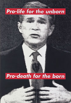
Barbara Kruger
State of California's Abortion and Welfare laws
Nancy Spero
Louise Bourgeois
Tracey Emin

Return to Nature


The second drawing project is meant to focus on a social or political issue that speaks to us. It is also to include text. One issue that particularly stands out to me is deforestation, an issue that I believe is not only ecological and economical but also has both social and political ramifications. In order for my project to confront the idea of deforestation I drew a forest with fully-grown trees as well as chopped down trees; but instead of simply drawing a realistic forest with fully grown trees and tree stumps, I decided to create a forest that was filled with fantastical life. I drew the trees so that they resembled fanciful, almost balletic human forms because I wanted to show the life and beauty within the trees that the people who are destroying them do not see. By forming these trees into human shapes I thought the viewer would feel more connected to them and could more readily relate to their beauty and the life within the trees. Amidst the whimsical forms which I have given the trees I have juxtaposed the stumps of others. Compared to the dancing trees the stumps are devoid of life and are meant to evoke a sense of empathy and sorrow for those spirited trees whose lives were destroyed. Color is another aspect I wanted to use in this project in order to create an energetic forest that is being decimated. I used blues, oranges, greens, and reds in this piece in order to portray the colors of the forest rather than just using the usual browns and greens. My influence in my color choices was the impressionist movement, specifically Monet. Monet’s use of color was incredible due to the fact that he tended to use color rather than tints and tones when creating his paintings. For instance, he avoided black when shading a piece in order to create a more fully dimensional, more life-like piece of art. Also, for instance, when he painted something that was meant to be the color purple he didn’t just paint the object purple, he included blues and reds and other colors. The final aspect of my piece is the text. The text that I decided to include is a quote by Jane Goodall, “You cannot get through a single day without having an impact on the world around you. What you do makes a difference, and you have to decide what kind of difference you want to make.” I used this quote, repeating it over and over, to create the forest floor. The quote is written around the trees and tree stumps and is meant to make a statement about how even though people talk about fixing things and making changes nothing really changes. Even as the words about change are being spoken and repeated over and over, the trees continue to be cut down and the forests destroyed.


                   Monet


-Renoir                              Renoir-

                                           Renoir                                                 Monet
http://www.intermonet.com/colors/ 


Thoughts and Prayers are not Enough! 

In this assignment I wanted to stray away from the conventions of portraiture and square paper compositions. I wanted to represent and reflect on Obama’s speech on the Oregon shooting in a visual way. I think that a shooting by itself is a huge problem society should address, but when it’s being repeated every few months, then it is a crises the whole nation should address head on. This piece is an invitation for action and a reflection piece on how special humans are. Firstly, I didn’t do it on a piece of paper because that seems to be the status quo of art assignments. In his speech he talks about how things eventually become routine and we are numb to them. I wanted to visually represent a removal from that. I chose to use a minimalist approach, combining Chinese and contemporary ink use to create a silhouette of a thunking person. The silhouette is supposed to represent thought and prayer, and show that thought and prayer is not enough to cause significant change to a major problem. The material used is a thin piece of tracing paper. Its fragility is aimed to suggest the fragility of human life. I was very inspired by the work of Xie Zhiliu (1910–1997) who used ink on paper to depicts landscapes and figures. His ink work is very detailed and the strokes have a very free and winding shape. The lines are quite thin and he leaves most of the page blank, embracing an almost minimalist style. I was very interested in merging this aesthetic with a modern political and social matter. The silhouette is filled with different shapes, forms, and masses that create a sort of collage. The patters that I employed in the figure signify the complexity and beautify of the human mind. It also depicts how fragile and precious human life is. The piece is supposed to be free of a single composition and its elements are meant to be rearranged every time its shown. Furthermore, the tracing paper is supposed to be used in any color wall, so that its setting contributes to the artwork itself. I aim for it to be viewed in whichever way and anywhere the audience wants to see it. It hopefully conveys a message for all and everywhere, and suggests that anyone who can see this artwork is partially responsible for the problems in our society. Xie Zhiliu’s use of ink heavily inspired my own process. I didn’t use a pen at all. I limited myself to the stick, varying its sharpness whenever appropriate. I used a variety of shapes and forms, but I mostly tried to use as much negative shapes, contrasted with positive shapes as possible. I wanted the text to be more of a banner than a simple sentence, almost as if it could be used in a protest or posted in a wall. Although I rarely politicize my work, I wanted to take advantage to bring light to an important issue in American society that transcends any differences between us. 


Artwork: Wang Hui (Chinese, 1632–1717
Xie Zhiliu (1910–1997)

Sources: http://www.artcritical.com/2008/12/14/landscapes-clear-and-radiant-the-art-of-wang-hui-at-the-metropolitan-museum-of-art/
http://pamayres.blogspot.com/2010/10/metropolitan-museum-of-art-mastering.html
http://www.asianart.com/exhibitions/tracing/9.html
http://www.britishmuseum.org/whats_on/past_exhibitions/2012/chinese_ink_paintings.aspx
https://www.metmuseum.org/toah/hi/hi_painpeac.htm