Caitlin
Albritton
Assignment
#1 Self as Subject
I
really struggled with the assignment initially. I tend to be averse to making
art about myself. In part because I find there are many more topics warranting
discussion, but also because I was unwilling to draw my own body. I am much
more drawn to drawing nude bodies than clothed bodies, because there is so much
more clarity in the muscles and bone when they are seen only through the skin.
However I am not yet ready to draw my own naked body, and much less ready to
then present it. I had a few ideas for how to avoid this. One idea I had was to
draw my face on a much older or much younger version of myself, thus using a
different body as reference. I also tried to find a position I could hold
myself in that would both hide my intimate parts and be dynamic and engaging,
while also being a pose I could hold and draw at the same time. This proved to
be impossible, or at least, unsatisfying. I decided to do a clothed, sitting
pose, which ended up being challenging enough to maintain and draw
simultaneously.
I
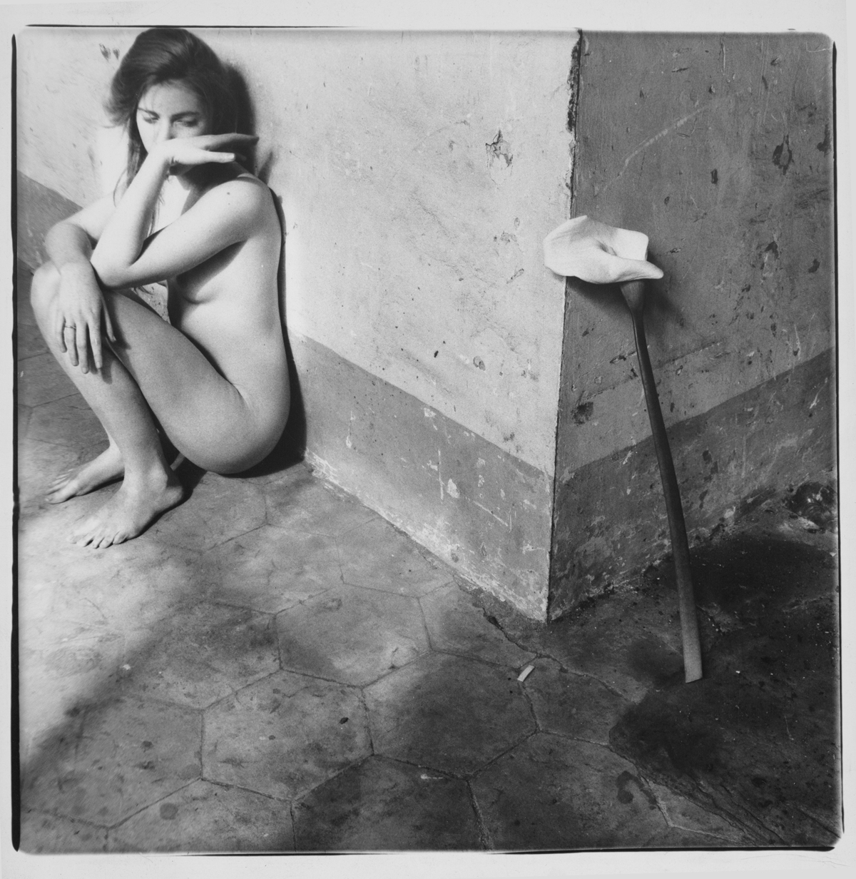
viewed some photographs by Francesca Woodman, desperately seeking inspiration.
I found similarities in her work to my own photography, and looked through some
of my old images. I revisited old photographs I had long ago loved and forgotten.
What has been and remains to be my favorite subject to photograph are abandoned
places, and broken things. There was one image I had taken at my favorite
location years ago that featured a woman sitting with a queenly posture in a
grungy room at sunset when all the shadows were long and dark. I admired the
attitude displayed in behaving so commanding and dynamic amidst shattered
glass, faded graffiti and stained particleboard. I respect the kind of people who can be confident and strong
even when their lives are in shambles, and decided to honor that in this piece.
It is also a nod to one of my interests that brought me to pursuing art in the
first place, which is a narrative in itself.
In
the drawing, I am sitting sideways in a round chair, with my legs hanging over
the side. I am relaxed and casual, open but confident, suggesting that I am at
ease in my otherwise unsettling surroundings. The background is bleak and empty,
but busy with dirty details. Cracks, stains, decay and neglect surround me in a
tight, stagnant room. While I have few complaints with the way the figure
turned out, I am not so happy with the background. I was hoping to keep the
focus at the center of the page, and have the background fade back into the
edges. I was unsuccessful with this, and have too much contrast and business
that I believe distract from the subject. If I were to do it again, I would
keep the background much more simple, and lighter.
Considering
how frustrating I found the entire process, from concept and planning to
execution, I like the end product more than I expected. I was also glad I got
to use photos I took as reference photos. I do this whenever I can, as it makes
the final image seem more “mine.” I was also happy to put use to old
photographs that hadn’t been viewed in months. Perhaps it won’t be the last
time I flip through Lightroom for inspiration.


No comments:
Post a Comment